


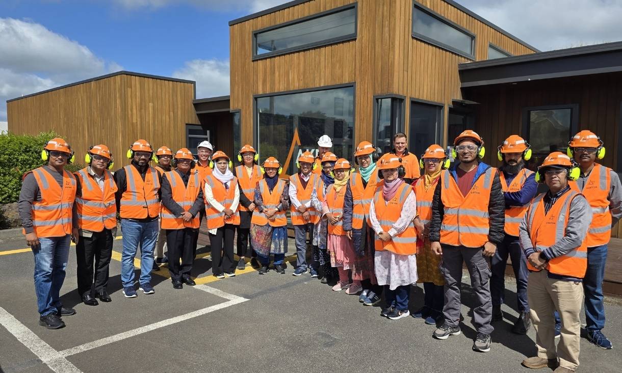
RMIT researchers help build climate-resilient housing in rural Bangladesh
Researchers from RMIT have partnered with the Palli Karma Sahayak Foundation (PKSF) in Bangladesh to build 40 sustainable and resilient housing solutions for vulnerable rural communities.
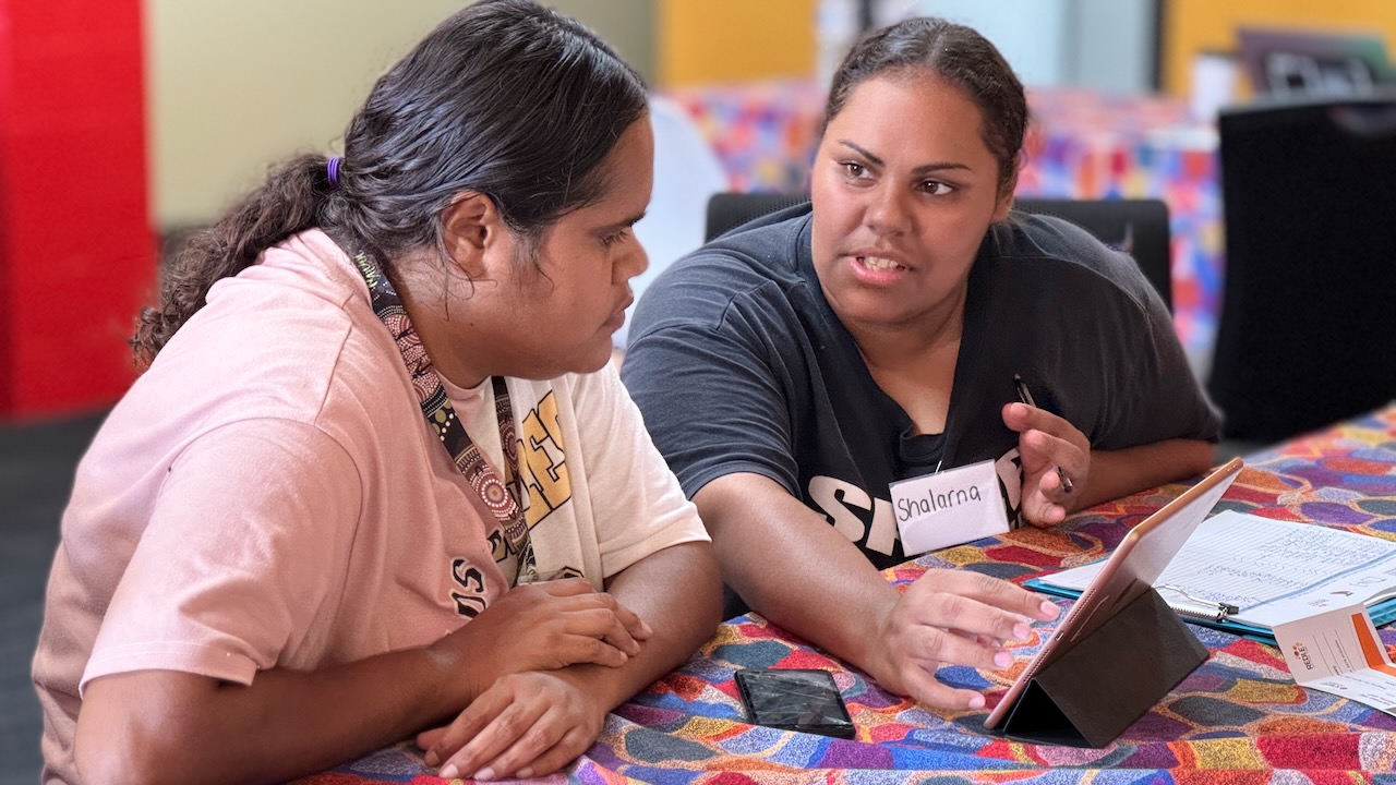
Internet use grows in remote First Nations communities, but cost still a barrier
A new report shows internet access in Australia’s remote and very remote communities improved in the past two years as 4G, Wi-Fi and satellite infrastructure is bolstered across regional Australia.

RMIT success at Victorian Premier’s Design Awards
An innovative bi-directional hospital transfer chair that facilitates seamless attendant-facing transfers has won a Victorian Premier Design Award alongside recognition for a more than dozen RMIT-affiliated projects.
New partnership with Cisco and Grampians Health to upskill healthcare sector
RMIT’s Health Transformation Lab and College of Vocational Education are piloting a program to rapidly upskill front-line staff, broader health workforce and IT professionals in the healthcare sector to meet the industry’s emerging skills needs.