Typographer’s ANZAC Square project one for the ages
Indigenous town names were the inspiration for Melbourne typographer Stephen Banham’s latest project, more than 200 square metres of commemorative bronze type screens at Brisbane’s ANZAC Square.
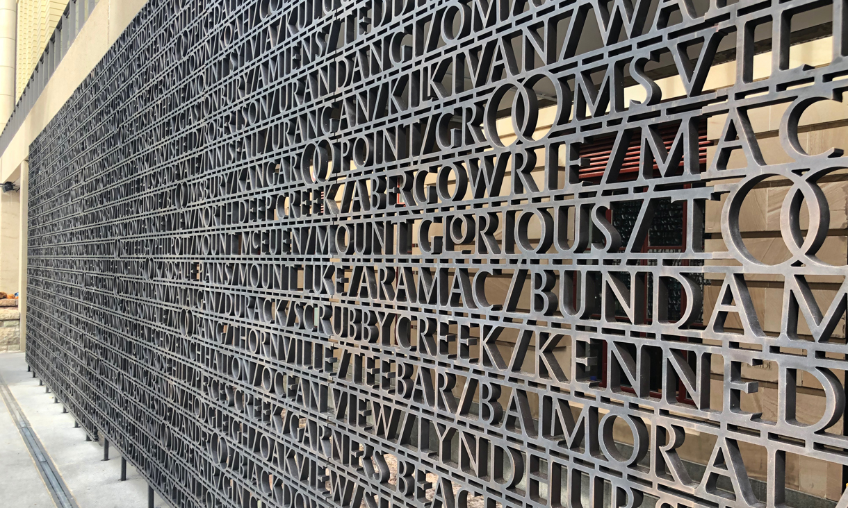
School of Design typography lecturer Stephen Banham was commissioned to create the work featuring 2072 Queensland town names as part of the final stage of the Square’s restoration and enhancement project.
He has created a dramatic design tied to the Indigenous names of many of the towns, including Toogoolawah, Woongoolba and Mooloolaba.
The project – an initiative between the Queensland Government, Australian Government and Brisbane City Council – was officially unveiled at a ceremony today.
Banham is best known as the typographer on the team behind Sans Forgetica, which is believed to be the first font designed to help you remember more of what you read.
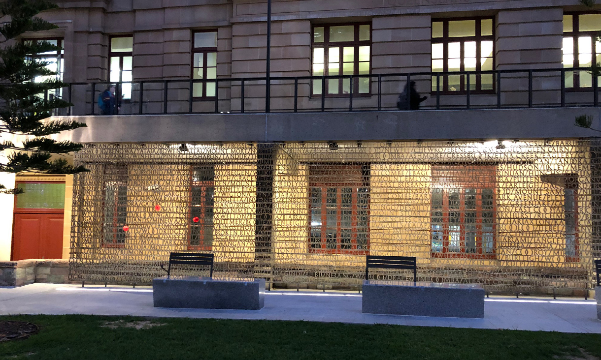
 The commemorative bronze type screens were installed at Brisbane’s ANZAC Square. Photo: Courtesy of TKD Architects
Invited by architecture firm TKD Architects to put forward a proposal, he said the concept came to him as he caught the train from Brisbane airport to the Square for the initial site visit.
“I kept seeing the suburban station names with double ‘Os’ in them and it really struck me as being really unique. They were everywhere,” Banham said.
This was indicative of the preservation of original indigenous place names in Queensland, the double 'O' being a phonetic interpretation of a sound common in many indigenous languages.
“I knew that this was the right concept for linking the design to place. When I pitched the idea to the Anzac Square Board officials, all Queenslanders, they were immediately on board and couldn’t believe they hadn’t seen it themselves.
“I guess sometimes it takes someone with that new perspective – in this case a Victorian, and a typographer– to see things that others see every day.
“It’s the training as a typographer that really made this approach possible, to see patterns and to create an underlying story specific to Queensland.”
Banham then customised the font, designing a vast array of ligatures or linked letters to create a typographic rhythm across the hundreds of rows. The double ‘O’ forms serve another purpose – they also create a space for people to put poppies and other flowers into.
Banham said he hoped the project – designed through his practice Letterbox, and used as a case study in his PhD – would be a legacy.
“It’s a privilege to work on this kind of project, something that I hope my grandchildren will see,” he said.
“Personally and professionally, it’s been a big 12 months with Sans Forgetica and the ANZAC Square project.
“Although the Sans Forgetica and the Anzac Square projects both share a spirit of collaboration and are founded in research, the latter has an enduring permanence to it rare in typographic works.”
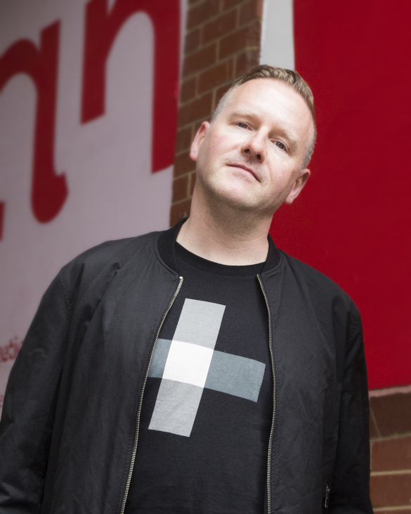 School of Design typography lecturer Stephen Banham was commissioned to create the work.
Acknowledgement of Country
RMIT University acknowledges the people of the Woi wurrung and Boon wurrung language groups of the eastern Kulin Nation on whose unceded lands we conduct the business of the University. RMIT University respectfully acknowledges their Ancestors and Elders, past and present. RMIT also acknowledges the Traditional Custodians and their Ancestors of the lands and waters across Australia where we conduct our business - Artwork 'Sentient' by Hollie Johnson, Gunaikurnai and Monero Ngarigo.