
Australia’s 2026–2027 Federal budget: A turning point for tax, housing, and sustainability
The Australian Federal Budget 2026–27 introduces one of the most ambitious economic reform agendas in recent decades. Framed around housing affordability, tax equity, and the climate transition, the budget proposes sweeping overhauls to capital gains tax (CGT), negative gearing, and sustainability reporting requirements.

Why solving big problems needs a new way to review literature
Grand Challenges cannot be solved by a single discipline. This can be about reducing food waste, addressing the climate crisis, helping people live healthier and other big aspirations. They demand bold, multidisciplinary solutions. Yet, when researchers attempt to synthesise existing knowledge to tackle these massive issues, they are often hindered by the very tools designed to help them.

Can we achieve a more sustainable future through marketing
Advancing the United Nations Sustainable Development Goals (SDGs) is a priority for communities and nations around the world. While most solutions are engrained in STEM and environmental science, marketing appears to be an unlikely lever for sustainability and inclusion.
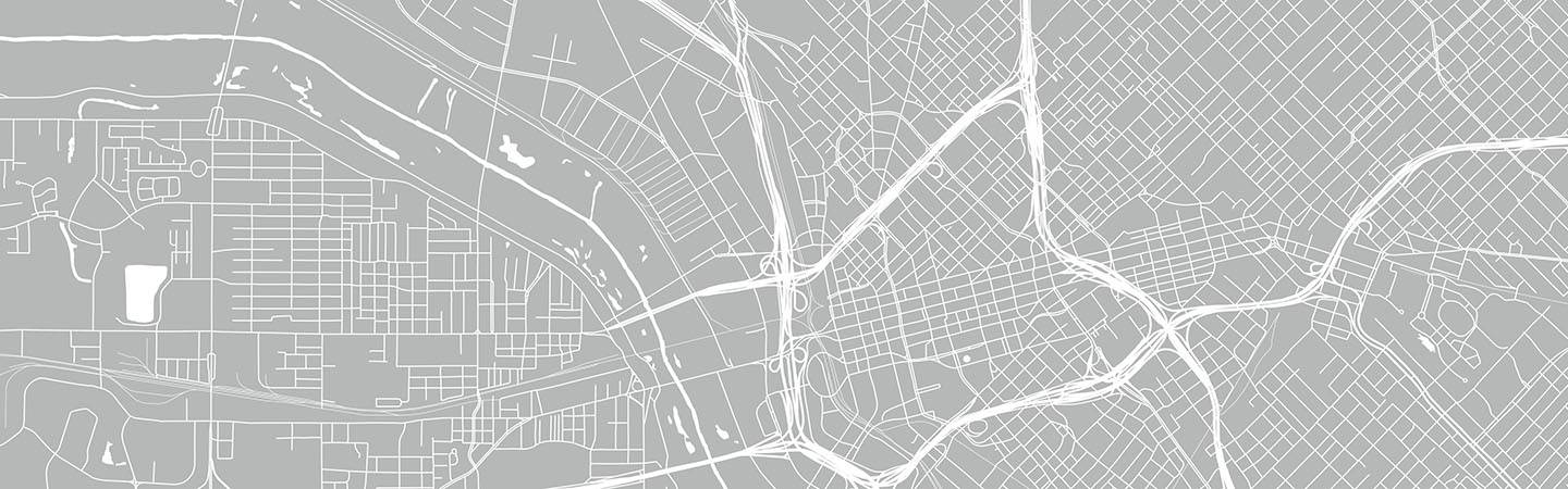
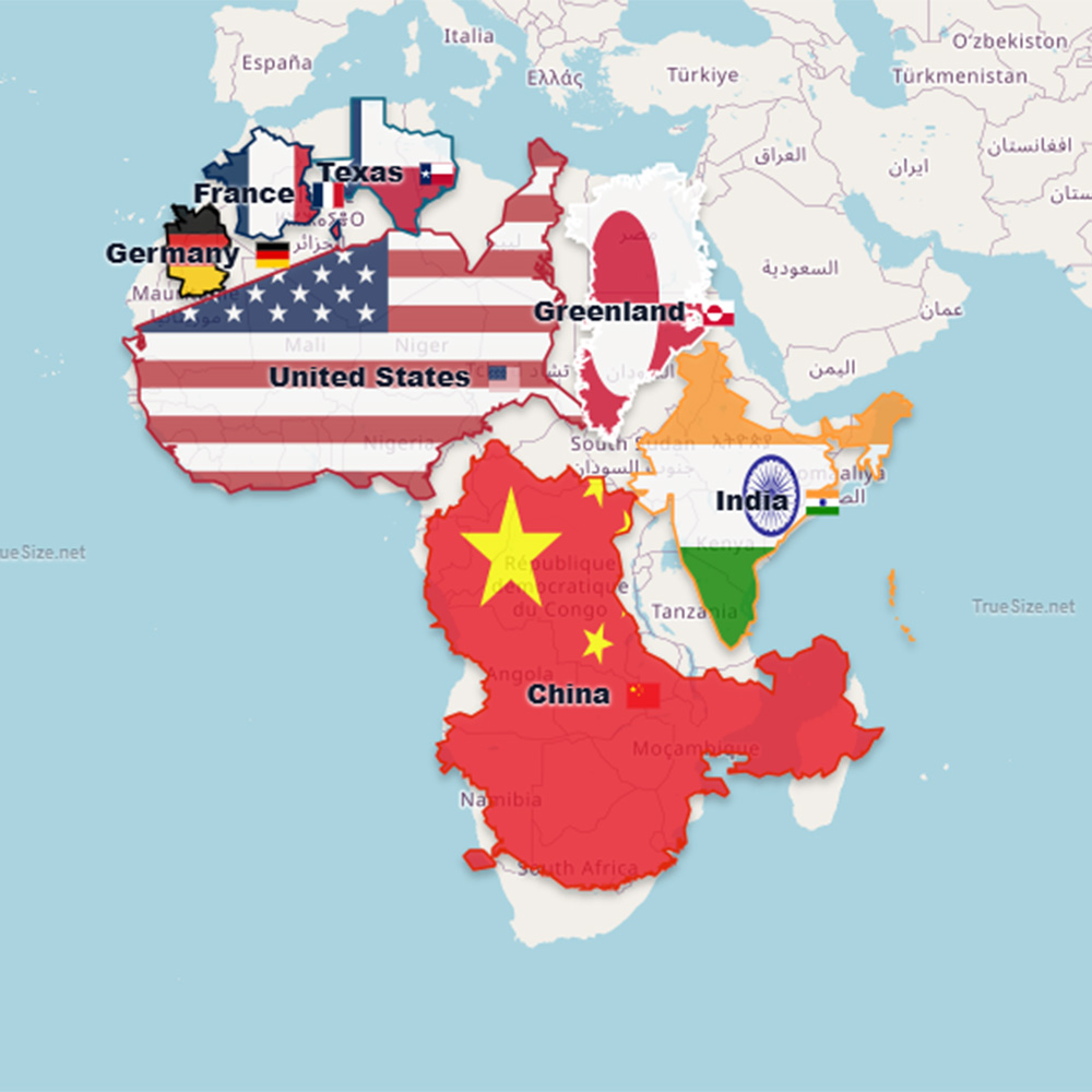
What map do they have in ‘the Situation Room’ at the White House? Map Projections and Global Politics
I have only been inside the White House once, back in 1997. The only maps I recall seeing then were old ones, dating back to the 18th and 19th centuries. However, I was not important enough to see the inside of the Oval Office, let alone ‘the Situation Room.’