The “great looking courses” problem.
It’s a familiar scenario across the sector— someone in a university is asked to find a great looking course for a showcase or conference. What seems like a simple request often becomes a challenging search, for a couple of reasons.
- There’s a lot of choice. RMIT has thousands of active Canvas shells.
- There’s a distinction between being a great educator and great course site designer.
Many courses are still primarily built by individual educators, often people with a wealth of discipline expertise, passion for teaching, excellent feedback delivery and industry experience— all things that really, really matter to students.
Now, while RMIT is rightly proud of its educators, the relationship between educator and an LMS course site is something akin to tomato-grower and pizza. Knowing about, and having access to the best, most-freshest tomatoes might help you make better pizza, but pizza-making demands a whole new set of skills.
Put another way — not all good tomato-growers make good pizza and not all good educators make good Canvas course sites.
What is the visual design and layout floor?
From this point on, we’ll be referring to the visual design and layout floor of RMIT’s Canvas course sites. This idea is built around four related concepts:
- Accessibility
- RMIT identity
- Consistency and structure
- Meaning
These concepts represent four ways in which visual design and layout can benefit students:
An accessible course is one in which the learning materials support the learning of all students studying the course.
A course with RMIT identity leverages the visual brand established by the marketing team to give students a distinct RMIT experience.
Consistency and structure are the patterned use of visual design and layout elements across multiple contexts. Good consistency and structure promote confidence through familiarity, reduce cognitive load and can save students’ time.
Successful learning is about creating meaning.The application of classical graphic design practice like colour, size, shapes, layouts and symbols can all contribute to student meaning-making of the learning materials, and in particular which content and tasks are the most critical.
So, with all of that said, the visual design and layout floor is simply the space where a university’s less visually engaging courses sit in terms of these four areas.
Raise the floor not the roof.
In the pre-Emble days of 2019, if you picked a random Canvas course site from one of RMIT’s three academic Colleges 1 (where courses were largely produced by the educators that teach them), you would get something across a wide gamut from whatever the visual equivalent of a teenager’s room is (low floor, probably covered in clothes2 to visually superlative (high ceiling)3.
In contrast, if you wanted to find an area at RMIT with a high visual design and layout floor you might look at RMIT Online or RMIT Creds. Why? Well, both of these areas used a consistent learning experience design approach, featuring style-guides and templates in conjunction with course production teams4 In these parts of RMIT choosing a random course would have likely resulted in something visually effective (high floor) but not necessary superlative.
This is not the criticism it might appear on the surface. Here’s why:
Evidence collated by John Hattie (2017) suggests that, broadly speaking, visual design and layout are not in the group of factors that most positively influence student learning achievement. Visual design and layout may, however, matter a lot to specific students. If we take a lesson from Hattie’s list ‘visually effective’ may be a better outcome for students than ‘visually superlative’… if the resources spent getting from effective to superlative could better be used elsewhere, for example, allocating more capacity to student feedback, which matters a lot.
Across the sector, the right amount of effort to spend on the different aspects of course design and delivery depends on factors like study-mode, class size, nature of the subject, and student expectations. If available resources preclude being amazing at everything, what are you going to choose?
Hello Emble
Let’s stop, make a nice hot drink, and reflect on what we’ve concluded so far:
- Out of the box, an LMS alone wasn’t going to deliver the expertise needed to have good quality visual design and layout in our courses.
- Whilst visual design and layout matters, they don’t influence student learning achievement as much as a range of other factors.
- It’s not sensible to ask educators to expend more effort (time) on the visual design and layout of their courses if there are more impactful things they could be doing.
- Visual design and layout varied across colleges (where the courses didn’t have the safety net of mature style guides and templates, though there are some notable and exceptional examples), when compared to places like RMIT Online and RMIT Creds, which have a more standardised approach.5
Thus, RMIT needed a way to raise the visual design and layout floor of the collective group of courses that might otherwise not meet student needs and expectations…without diverting precious resources away from more impactful aspects of the learning and teaching experience.
And so Emble was born.
The six-week challenge
The usual starting point when you have a problem like this is to scan the market and find a product that fills the need, which is exactly what we did. The available options
- Had too many features rather than the right ones, resulting in usability issues.
- Lacked the flexibility to adapt to RMIT’s evolving models.
- Failed too many of the user-acceptance criteria set by the business at the time.
Not to be deterred, an ambitious community of product owners, developers and designers from across RMIT pitched the idea that they could build something in six weeks to their directors from RMIT Studios6 and RMIT Online. On 25 February 2019, the team made their first commit7 to the codebase that to this day, is Emble. Six weeks later Emble was being used by the RMIT Creds, RMIT Online and the VE Design Team to build real courses.8
Ironically, the initial team was populated with staff from high visual design and layout floor areas like RMIT Creds, RMIT Online and the VE Design Team, because in many ways what the team was trying to do was build a product that both minimised the reliance on themselves (in terms of supporting others to build courses) and saved themselves time (when building courses). If learning and digital media designers are a scarce resource that can’t be available to directly work on all of the courses, how would we best ensure their expertise reaches students?
The answer was to create a tool that would allow learning and digital media designers to easily make available to educators the kind of assets that normally require specialised design expertise e.g., HTML and CSS coding.9
Simple but brilliant
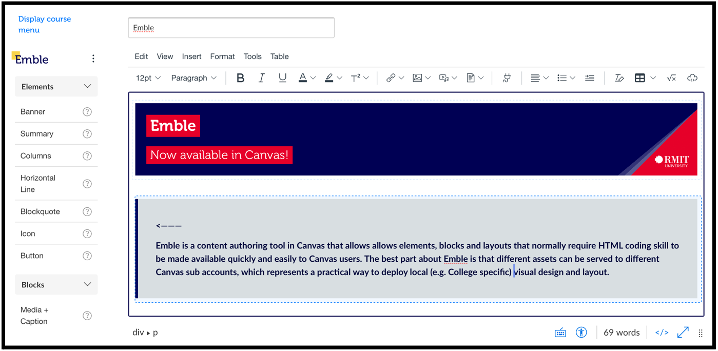
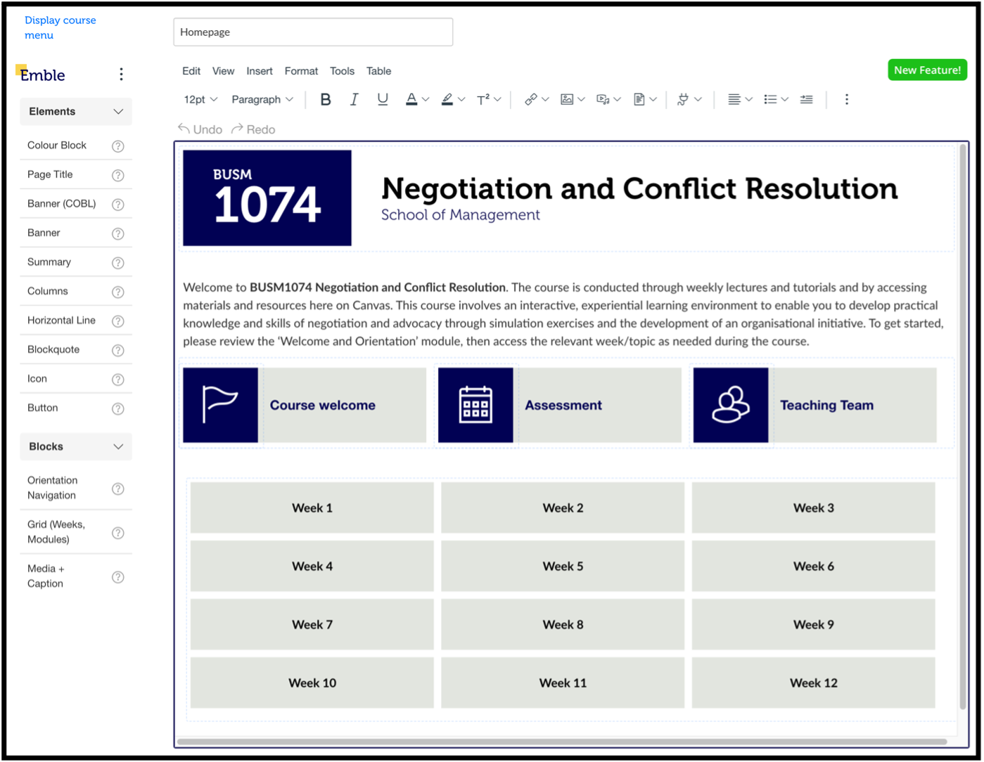
Emble is a tool that works alongside the default Canvas rich content editor but instead of providing a set of generic visual design options, offers individual educators a set of RMIT specific assets to choose from. When editing a page, Canvas users don’t really need the Course menu so they can just toggle to the Emble interface to quickly access important assets – no HTML or CSS code required and no time-consuming importing, either. Once editing is complete the educator can toggle the course menu back on and navigate to other areas of their course as needed.
Emble has three different types of assets:
- Elements – a single item like a banner
- Blocks – multiple elements grouped together (such as an image with heading, descriptive text and caption in a callout box)
- Layouts – an entire page structure ready to populate with content

