Matthew Lillywhite has some helpful Excel Spreadsheet tips for you, using what he learned in his Certificate IV in Accounting and Bookkeeping at RMIT.

Excel Tips and Tricks - Get the RMIT Know-How
Thanks to the Certificate of Accounting and Bookkeeping Matthew's learnt how to replace time-consuming sums using pen and paper with an Excel spreadsheet on a laptop.
Hi there! I really love helping people see the meaning in the numbers. That’s why I’m studying a Certificate IV in Accounting and Bookkeeping at RMIT.
Being able to make the numbers visual – turning them into graphs and charts and infographics helps people understand the numbers better – means you can do more with the data. And anything that helps you gain financial literacy has to be a good thing.
But unless you’re like me and love numbers, most people feel a bit scared or frustrated by the numbers. They know there’s something of value in there, but they don’t know where to look.
With what I’ve learned at RMIT, I’ve created a simple spreadsheet that gives a predictive look at the market – seeing the trends and trying to spot where the market is going.
Personally, I’m quite interested in real estate and I really enjoy learning about just how volatile and unpredictable it is and trying to make sense of it all.
I created the spreadsheet with housing prices in mind, but using some of the functions I’ve been taught to use, you can make it work for whatever interests you the most.
Here’s how to make a predictive spreadsheet work for you.
Download the spreadsheet and open it up
Click here and follow the prompts. Some computers will ask if you want to open it automatically. If not, you can open it in Microsoft Excel
Get the data you want to use.
You can download it from the internet – as I did with the house prices in the area. Or, you can input the prices manually – I did this sometimes when house prices were published on the weekend.
Tip: The current data in the spreadsheet relates to house prices in a specific area. The information in there is not important at this stage. But there are formulas incorporated into the spreadsheet which allow you to identify the average costs of those house.

Feel free to use those formulas or create new ones as you see fit.
Organise the data.
Once you have the data in the spreadsheet, you need to organise it.
You’ll need to identify two different factors.
I wanted to find the average price of houses and how the costs varied over time. So, I wanted to measure the average cost of a property per month. And how that changes.
So, I chose the two variables to be cost and date.
This next bit is important. Whatever you want to identify most – in this case it was cost – becomes the secondary factor.
This makes the date, in this instance, the dominant factor.
This goes along the horizontal axis.

The cost becomes the secondary factor and goes up the vertical axis.

Tip: Think about it this way. The information you want is best described as cost/month. Think of the / as the line on a graph: Cost is the vertical axis, Month (time) is the horizontal. Cost / month.

For your spreadsheet, it could be about comparing the cost of shoes.
The two variables might be cost and location.
In this instance, the cost might become the dominant factor, and the location becomes the secondary factor – allowing us to see, easily, how location might influence price. Our graph then will look like: Cost / location.
Apply the relevant function
The Forecast function embedded into this spreadsheet helps us see the average price of a house.
There are a host of other functions available.
Feel free to use whichever function you need.
Three others worth looking at are:
CORREL
There is a Correlation Tool available as a Data Analysis add-in. I think the CORREL tool is better, because it adjusts figures in real time when input numbers change.
LINEST
This is short for Line Estimate. It’s a version of a Regression tool.
TREND
Another forecasting function allowing you to see what the next figure will be, based on previous data.


Display the data
Humans, as a rule, are better at understanding things they can see or touch.
We can’t really touch data, but we CAN see it.
Finding an interesting way to display the data helps make it clearer to the person who’ll be reading the data.
It allows us to see, at a glance, what’s happening. So, we can more clearly identify changes or trends.
You can display the data as a graph, as a pie chart, as a dynamic table – whichever makes the most sense for you.[1]
Excel has some already built in.
Just select the data you want to display. (Remember to include any headings you want to include in the chart.)
If your version of excel has a “chart” button showing in the toolbar, click on that.
If not, click on the “Insert” button, and look for “chart” button. You should be able to just hover over that and decide which type of chart you want to use.
Click on that.

Your data will be displayed in that chart - it’s that easy.
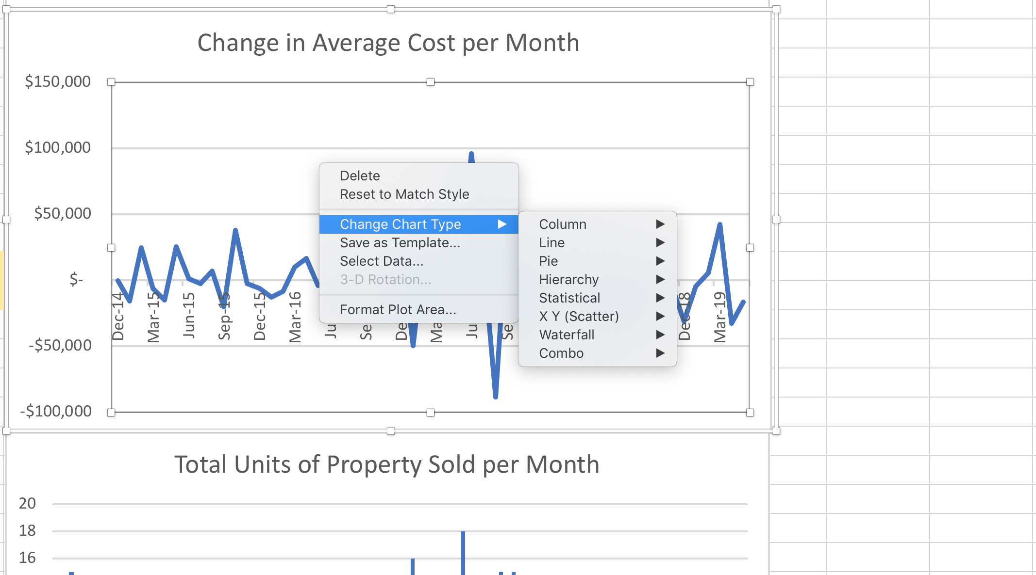
And, if you want to change the x and y axis, just right click (or control click on a Mac) or open up the design function under the “chart tools” button. You’ll see a heading called “switch row/column” - just click on that.
Analyse the data
Once you have the data you need, organised and displayed, you can see the points you’re trying to understand.
For instance: How much are house prices moving? Or, what are the big fluctuations?
Predict the future
OK. You can’t absolutely predict the future. But, the more data you collect, and arrange (if it’s arranged in the right way), the more likely you are to have a better idea about where the market, as a whole, is moving – which helps you be able to predict with greater confidence what is more likely to happen for a single purchase, and therefore, what actions you might take.
Tip: If there are some big outliers – in this case, houses that sold for way over or way under expectation – we can remove those outliers to get a clearer picture of the trend and, taking into account the potential for an outlier, we get a better understanding of what should happen next.

Tip: If we cross-reference this timeline with international and national events, we can see what external events have an impact on prices, and if they occur in the timeline we will be looking at, we’ll know to take those things into account when determining what is most likely to happen.
That’s it.
That’s the know how I got from RMIT.
Good luck with whatever you’re measuring.
The best thing to do is start playing with the numbers and see what insights you can draw from your data.