How should a lab that interrogates colour represent itself? Chroma Waste Lab's visual narrative was developed as design research rather than brand decoration, working through the same question the Lab asks of industry: what does it mean to use colour accountably, and what should you refuse?
Why a lab
A lab, rather than a studio or a campaign, because the argument has to be testable. Colour in industry is settled by assertion, a season, a name, a claim, and an assertion can only be repeated, never checked. A lab keeps samples, takes measurements and leaves a record; it builds the means of its own correction. A visual narrative is the first place to prove that, or to quietly avoid it.
The mono position
The identity works in black and white. A lab arguing that colour is a commons rather than a property cannot coherently claim a proprietary brand colour, so it does not. The logo system runs across a stacked lockup, horizontal one-line and two-line variants, a text-only setting and a standalone mark, all in mono. Where colour appears on Lab materials, it is the pigment itself, photographed, not a specified brand hue. This is the identity's central argument: the only colour the Lab claims is the colour it recovered.



Typography
Set in Neue Monopolar, Regular and Semi Bold. A monolinear, technical letterform that holds the Lab's material-first, evidence-led register without decorative appeal to craft or sustainability visual convention.
Event lockups
The system extends to co-branded lockups for venues the research travels to. Each retains the mono discipline, so the Lab reads consistently across international contexts without adapting to house styles.
- LDF26, London Design Festival 2026
- INCLUDE26, INCLUDE London 2026, Royal College of Art
- DRS26, Textile Intersections 2026, Design Research Society
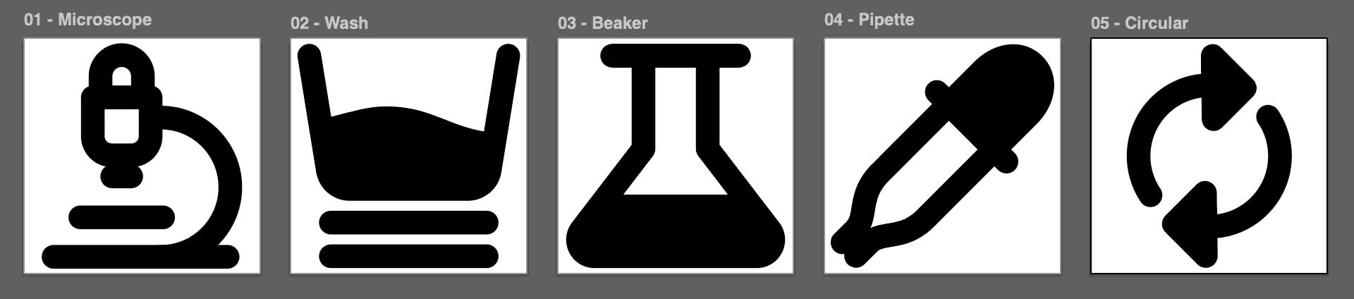
Icon system
Six variant sets across outlined, stroke, flat and round treatments, developed for exhibition wayfinding, workshop materials and the participatory programmes. The icons draw on the material process itself: microscope, dye bath, flask, dropper and circulation loop.
Colour explorations for exhibition collateral
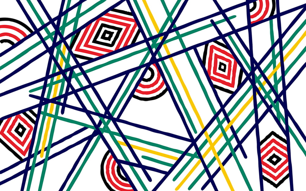
Ten gradient studies, five linear and five radial, developed as exhibition and event collateral rather than as brand colour. Each holds a saturated chromatic field against the mono identity, testing how far colour can be pushed before it becomes decoration.
These are collateral, not identity. The Lab's visual narrative holds to mono. Colour enters only where it is being examined. The gradients are screen colour, made in RGB, and carry no relationship to the recovered pigment. That distinction is deliberate and is stated here so it is read as a boundary rather than an oversight.





Poster series
Twenty A3 landscape posters. Each pairs one of the Lab's five narratives with a gradient field, the mono logo and lockup, then credits the researchers. The series is the first test of whether the identity holds when it has to compete for attention in a busy conference, research, or festival environment.
The five narratives carried by the series:
- The invisible supply chain. Colour is one of design's most invisible supply chains.
- Throwing cotton at cotton. Colour recovered mechanically and returned to new cloth.
- Colour, co-authored. The knowledge is already in the room.
- What colour remains. Colour persists and transforms beyond first use.
- A standard for colour. Developing criteria across material, social and cultural dimensions.
Why this sits under Colour, ethics and knowledge systems
This research area asks who decides what a colour is, and on whose terms. An identity is one of the places that decision gets made, quietly and by default, when an organisation selects a hue and claims it. The Lab declines to make that claim. Holding the identity to mono is the same argument applied to the Lab's own representation, and the choices are recorded here so they can be questioned. A practice that asks industry to account for its colour should be able to account for its own.
Without hue, the system has to work harder and more honestly. Hierarchy is carried by scale, weight and interval rather than by a colour cue standing in for a decision. Emphasis is earned through position and spacing; contrast is tonal, measured in value rather than temperature. What colour usually conceals, a weak structure, an unresolved sequence, a heading that has not justified itself, has nowhere to hide.
Images are held to the same rule. Dye baths, effluent, swatch cards and sorted textile waste are reproduced single-channel, so a pigment cannot arrive as spectacle before it arrives as evidence. Any colour present in the work is there because a sample, a substrate or a process put it there, never because the identity applied it. The only colour in the system belongs to the material under study, and it is captioned accordingly.
Design work
Dennis Iaonnou, Jacinta kay and Tonya Meyrick